

Table of contents
- What is CSS Grid?
- What is a grid value in CSS?
- What is an inline-grid value in CSS?
- Properties for Specifying a Grid's Layout
- Grid container's properties
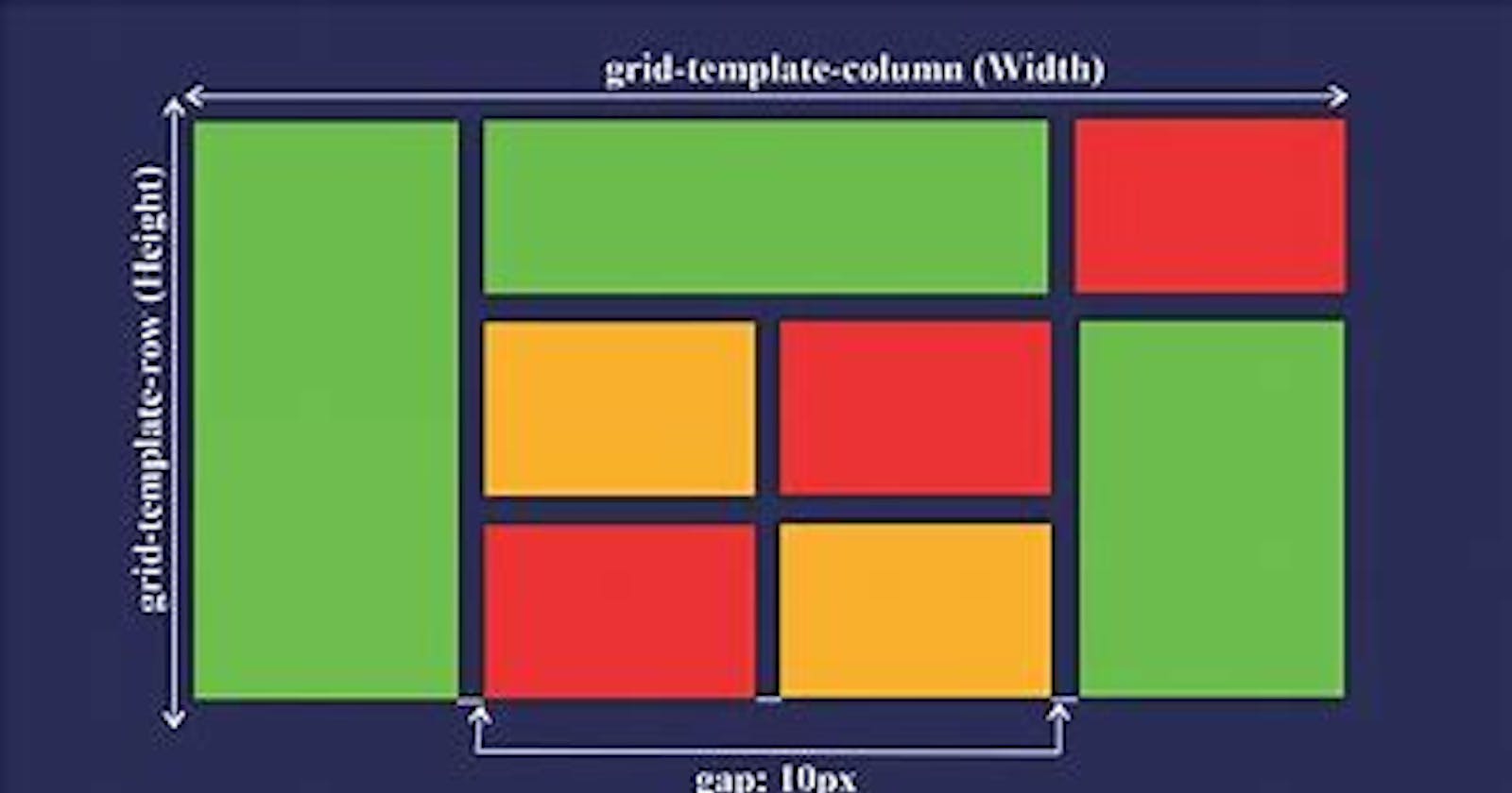
- What is CSS Grid's grid-template-columns property?
- What is CSS Grid's grid-template-rows property?
- What is CSS Grid's justify-content property?
- What is justify-content: start in CSS Grid?
- What is justify-content: center in CSS Grid?
- What is justify-content: end in CSS Grid?
- What is justify-content: space-evenly in CSS Grid?
- What is justify-content: space-between in CSS Grid?
- What is justify-content: space-around in CSS Grid?
- What is justify-content: space-evenly in CSS Grid?
- What Is CSS Grid's justify-items Property?
- What Is CSS Grid's align-content Property?
- What Is CSS Grid's align-items Property?
CSS Grid gives you the tools to create basic and advanced website layouts in responsive ways that look great on mobile, tablet, and desktop devices.
What is CSS Grid?
The CSS Grid Layout Module makes browsers display the selected HTML element as grid box models.
Grid allows you to easily resize and reposition a grid container and its items two-dimensionally.
Note:-"Two-dimensionally" means grid modules allow simultaneous laying out of box models in rows and columns.
What is a grid value in CSS?
Grid tells browsers to display the selected HTML element as a block-level grid box model.
In other words,m setting an element's display property's value to the grid turns the box model into a block-level.
Example:-
section {
  display: grid;
  background-color: orange;
  margin: 10px;
  padding: 7px;
}
Note:- The display: grid directive creates only a single-column grid container. Therefore, the grid items will display in the normal layout flow (one item below another).
- The
display: griddirective only affects a box model and its direct. It does not affect grandchildren nodes.
What is an inline-grid value in CSS?
inline-gridtells browsers to display the selected HTML element as an inline-grid box model.In other words, setting an element's
displayproperty's value toinline-gridturns the box model into an inline-level grid layout module.
Example:-
section {
  display: inline-grid;
  background-color: orange;
  margin: 10px;
  padding: 7px;
}
Note:- The display: inline-grid directive only affects a box model and its direct children. It does not affect grandchildren nodes.
Properties for Specifying a Grid's Layout
On converting a regular HTML element to a grid (or inline-grid) box model, the grid layout module provides two categories of properties for positioning the grid box and its direct children:
Grid container's properties
Grid item's properties
Grid container's properties
A grid container's properties specify how to browsers should layout items within the grid box model.
The eight(8) types of grid container properties are:-
grid-template-columnsgrid-template-rowsgrid-auto-columnsgrid-auto-rowsjustify-contentjustify-itemsalign-contentalign-items
What is CSS Grid's grid-template-columns property?
- grid-template-columns specifies the number and widths of columns browsers should display in the selected grid container.
Example:-
section {
  display: grid;
  grid-template-columns: 95px 1fr;
  background-color: orange;
  margin: 10px;
  padding: 7px;
}
What is CSS Grid's grid-template-rows property?
- grid-template-rows specifies the number and heights of rows browsers should display in the selected grid container.
Example:-
section {
  display: grid;
  grid-template-rows: 95px 1fr 70px;
  background-color: orange;
  margin: 10px;
  padding: 7px;
}
What is CSS Grid's justify-content property?
justify-content specifies how browsers should position a grid container's columns along its row axis.
The
justify-contentproperty accepts the following values:startcenterendstretchspace-betweenspace-aroundspace-evenly
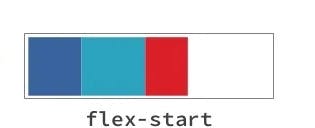
What is justify-content: start in CSS Grid?
start positions the grid container's columns with its row-start edge.
Example:-
section {
  display: grid;
  justify-content: start;
  grid-template-columns: repeat(4, 40px);
  background-color: orange;
  margin: 10px;
}
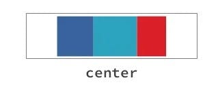
What is justify-content: center in CSS Grid?
center positions the grid container's columns to the center of the grid's row axis.
Example:-
  section {
    display: grid;
    justify-content: center;
    grid-template-columns: repeat(4, 40px);
    background-color: orange;
    margin: 10px;
  }
What is
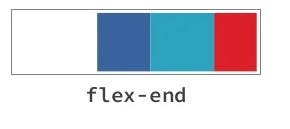
justify-content: endin CSS Grid?end positions a grid container's columns with its row-end edge.
What is
justify-content: space-evenlyin CSS Grid?space-evenlyassigns even spacing to both ends of a grid container and between its columns.Example:-section { display: grid; justify-content: end; grid-template-columns: repeat(4, 40px); background-color: orange; margin: 10px; }What is
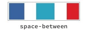
justify-content: space-betweenin CSS Grid?space-between does the following:
It positions a grid container's first column with its row-start edge.
It positions the container's last column with the row-end edge.
It creates even spacing between each pair of columns between the first and last columns.
Example:-
    section {
      display: grid;
      justify-content: space-between;
      grid-template-columns: repeat(4, 40px);
      background-color: orange;
      margin: 10px;
    }
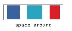
What is justify-content: space-around in CSS Grid?
space-around assigns equal spacing to each side of a grid container's columns.
Therefore, the space before the first column and after the last one is half the width of the space between each pair of columns.
Example:-
  section {
    display: grid;
    justify-content: space-around;
    grid-template-columns: repeat(4, 40px);
    background-color: orange;
    margin: 10px;
  }
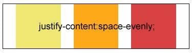
What is justify-content: space-evenly in CSS Grid?
space-evenly assigns even spacing to both ends of a grid container and between its columns.
Example:-
  section {
    display: grid;
    justify-content: space-evenly;
    grid-template-columns: repeat(4, 40px);
    background-color: orange;
    margin: 10px;
  }
What Is CSS Grid's justify-items Property?
justify-items specifies the default justify-self value for all the grid items.
Example:-
section {
  display: grid;
  justify-items: start;
  grid-template-columns: 1fr 1fr;
  background-color: orange;
  margin: 10px;
}
What Is CSS Grid's align-content Property?
align-content specifies how browsers should align a grid container's rows along the container's column axis.
Note:
A column axis is sometimes called a block axis.
The
align-contentproperty works if the total row heights are less than the grid container's height. In other words, you need free space along the container's column axis to align its rows up or down.
Example:-
section {
  display: grid;
  align-content: start;
  grid-template-columns: 1fr 1fr;
  background-color: orange;
  margin: 10px;
  height: 300px;
}
What Is CSS Grid's align-items Property?
align-items specifies the default align-self value for all the grid items.
Example:-
section {
  display: grid;
  align-items: start;
  grid-template-columns: 1fr 1fr;
  background-color: orange;
  margin: 10px;
  height: 400px;
}
HAPPY Learning!!!💫