

In this article, I will talk about how to use responsive design and media queries to make this happen. I will also provide code examples for media queries using ma and min widths.
Introduced Media Queries
- Media queries in CSS3 extended the CSS2 media types idea: Instead of looking for a type of device, they look at the capability of the device.
Media queries can be used to check many things, such as:
width and height of the viewport
width and height of the device
orientation (is the tablet/phone in landscape or portrait mode?)
resolution
Using media queries is a popular technique for delivering a tailored style sheet to desktops, laptops, tablets, and mobile phones (such as iPhone and Android phones).
What is Media Query?
- In CSS, a media query is used to apply a set of styles based on the browser's characteristics including width, height, or screen resolution.
The basic syntax of media query
- Here is the basic syntaxfor media query in CSS:
@media media-type (media-feature){
/*Styles go here*/
}
Let's break down this syntax means.
The @media is a type of At-rule in CSS. These rules will dictate what the CSS will look like based on certain conditions.
The media type refers to the category of media for the device. The different media types include all, print, screen and speech.
all-works for all devices
print- works for devices where the media is in print preview mode
screen-works for devices with screens
speech-works for devices like screen readers where the content is read out loud to the user
You can choose to omit media type and use this syntax instead.
@media (media-feature){
/*Styles go here*/
}
If you wanted to create more complex media queries, then you can use logical operators.
and- This operator is used to join multiple media features. If all of the media features are true then the style inside the curly braces will be applied to the page.not- This operator reverses a true query into a false and a false query into a true.,(comma) - THis operator will separate multiple media features by commas and apply the styles inside the curly brace if one of the conditions is true.
Media query examples
Let's take a look at a few examples that show how to use media queries in CSS.
In this first example, we want the background color to change to blue when the width of the device is 600px or less.
In the CSS, we want to add a
(max-width: 600px)for the media query which tells the computer to target devices with a screen width of 600px and less.Inside the media query, we change the background styles for the body to
background-color: #87ceeb;.
@media (max-width: 600px) {
  body {
    background-color: #87ceeb;
  }
}
- In this second example, we want to change the background color from blue to red if the device has a width between 600 and 768px. We can use the
andoperator to accomplish this.
@media (min-width: 600px) and (max-width: 768px) {
  body {
    background-color: #de3163;
  }
}
Breakpoint
You can add as many breakpoints as you like.
We will also insert a breakpoint between tablets and mobile phones.
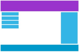
Desktop
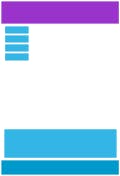
Tablet
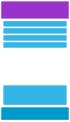
Phone
We do this by adding one more media query (at 600px), and a set of new classes for devices larger than 600px (but smaller than 768px):
Example:-
- Note:- that the two sets of classes are almost identical, the only difference is the name (
col-andcol-s-):
/* For mobile phones: */
[class*="col-"] {
  width: 100%;
}

@media only screen and (min-width: 600px) {
  /* For tablets: */
  .col-s-1 {width: 8.33%;}
  .col-s-2 {width: 16.66%;}
  .col-s-3 {width: 25%;}
  .col-s-4 {width: 33.33%;}
  .col-s-5 {width: 41.66%;}
  .col-s-6 {width: 50%;}
  .col-s-7 {width: 58.33%;}
  .col-s-8 {width: 66.66%;}
  .col-s-9 {width: 75%;}
  .col-s-10 {width: 83.33%;}
  .col-s-11 {width: 91.66%;}
  .col-s-12 {width: 100%;}
}

@media only screen and (min-width: 768px) {
  /* For desktop: */
  .col-1 {width: 8.33%;}
  .col-2 {width: 16.66%;}
  .col-3 {width: 25%;}
  .col-4 {width: 33.33%;}
  .col-5 {width: 41.66%;}
  .col-6 {width: 50%;}
  .col-7 {width: 58.33%;}
  .col-8 {width: 66.66%;}
  .col-9 {width: 75%;}
  .col-10 {width: 83.33%;}
  .col-11 {width: 91.66%;}
  .col-12 {width: 100%;}
}
Typical Device Breakpoints
- There are tons of screens and devices with different heights and widths, so it is hard to create an exact breakpoint for each device. To keep things simple you could target five groups:
Example:-
/* Extra small devices (phones, 600px and down) */
@media only screen and (max-width: 600px) {...}

/* Small devices (portrait tablets and large phones, 600px and up) */
@media only screen and (min-width: 600px) {...}

/* Medium devices (landscape tablets, 768px and up) */
@media only screen and (min-width: 768px) {...}

/* Large devices (laptops/desktops, 992px and up) */
@media only screen and (min-width: 992px) {...}

/* Extra large devices (large laptops and desktops, 1200px and up) */
@media only screen and (min-width: 1200px) {...}
Hide Elements With Media Queries
- Another common use of media queries, is to hide elements on different screen sizes:
I will be hidden on small screens.
/* If the screen size is 600px wide or less, hide the element */
@media only screen and (max-width: 600px) {
  div.example {
    display: none;
   }
}
HAPPY Learning!!!!💫