


What is the CSS position property?
The CSS position property defines the position of an element in a document. This property works with the left, right, top, bottom and z-index properties to determine the final position of an element on a page.
There are five values the position property can take. They are:
staticrelativefixedabsoluteZ-indexsticky
Let's discuss each one of them.
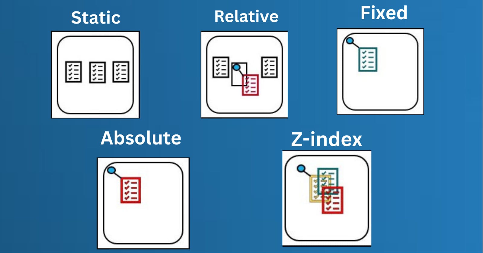
1. Static positioning
Static positioning is the default that every element gets. It just means "put the element into its normal position in the document flow — nothing special to see here."
To see this (and get your example set up for future sections) first add a class of positioned to the second <p> in the HTML:
<p class="positioned">…</p>
Now add the following rule to the bottom of your CSS:
.positioned {
  position: static;
  background: yellow;
}
If you save and refresh, you'll see no difference at all, except for the updated background color of the 2nd paragraph. This is fine — as we said before, static positioning is the default behavior!
Note: You can see the example at this point live at 1_static-positioning.html
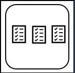
2. Relative positioning
Elements with position: relative remain in the normal flow of the document. But, unlike static elements, the left, right, top, bottom and z-index properties affect the position of the element. An offset, based on the values of left, right, top and bottom properties, is applied to the element relative to itself.
Let's replace position: static with position: relative in our example.
.main-element {
    position: relative;
    left: 10px;
    bottom: 10px;
    background-color: yellow;
    padding: 10px;
}
Introducing top, bottom, left, and right
top, bottom, left, and right are used alongside position to specify exactly where to move the positioned element too. To try this out, add the following declarations to the .positioned rule in your CSS:
top: 30px;
left: 30px;
3. Fixed positioning
Fixed position elements are similar to absolutely positioned elements. They are also removed from the normal flow of the document. But unlike absolutely positioned elements, they are always positioned relative to the <html> element.
One thing to note is that fixed elements are not affected by scrolling. They always stay in the same position on the screen.
.main-element {
    position: fixed;
    bottom: 10px;
    left: 10px;
    background-color: yellow;
    padding: 10px;
}

html {
    height: 800px;
}

4. Absolute positioning
Elements with position: absolute are positioned relative to their parent elements. In this case, the element is removed from the normal document flow. The other elements will behave as if that element is not in the document. No space is created for the element in the page layout. The values of left, top, bottom and right determine the final position of the element.
One thing to note is that an element with
position: absoluteis positioned relative to its closest positioned ancestor. That means that the parent element has to have a position value other thanposition: static.If the closest parent element is not positioned, it is positioned relative to the next parent element that is positioned. If there's no positioned ancestor element, it is positioned relative to the
<html>element.Let's get back to our example. In this case, we change the position of the main element to
position: absolute. We will also give its parent element a relative position so that it does not get positioned relative to the<html>element.
.main-element {
    position: absolute;
    left: 10px;
    bottom: 10px;
    background-color: yellow;
    padding: 10px;
}
.parent-element {
    position: relative;
    height: 100px;
    padding: 10px;
    background-color: #81adc8;
}
.sibling-element {
    background: #f2f2f2;
    padding: 10px;
    border: 1px solid #81adc8;
}

5. z-index positioning
All this absolute positioning is good fun, but there's another feature we haven't considered yet. When elements start to overlap, what determines which elements appear over others and which elements appear under others? In the example we've seen so far, we only have one positioned element in the positioning context, and it appears on the top since positioned elements win over non-positioned elements. What about when we have more than one?
Try adding the following to your CSS to make the first paragraph positioned too:
p:nth-of-type(1) {
  position: absolute;
  background: lime;
  top: 10px;
  right: 30px;
}
At this point you'll see the first paragraph colored lime, moved out of the document flow, and positioned a bit above where it originally was. It's also stacked below the original
.positionedparagraph where the two overlap. This is because the.positionedparagraph is the second paragraph in the source order, and positioned elements later in the source order win over positioned elements earlier in the source order.Web pages also have a z-axis: an imaginary line that runs from the surface of your screen towards your face (or whatever else you like to have in front of the screen).
z-indexvalues affect where positioned elements sit on that axis; positive values move them higher up the stack, and negative values move them lower down the stack. By default, positioned elements all have az-indexofauto, which is effectively 0.
To change the stacking order, try adding the following declaration to your p:nth-of-type(1) rule:
z-index: 1;

6. Sticky positioning
There is another position value available called position: sticky, which is somewhat newer than the others. This is a hybrid between relative and fixed positions. It allows a positioned element to act like it's relatively positioned until it's scrolled to a certain threshold (e.g., 10px from the top of the viewport), after which it becomes fixed.
Basic Example:-
Sticky positioning can be used, for example, to cause a navigation bar to scroll with the page until a certain point and then stick to the top of the page.
.positioned {
  position: sticky;
  top: 30px;
  left: 30px;
}
HAPPY Learning!!!!💫