


what is Flexbox?
CSS Flexible Layout Box, popularly known as Flexbox is a powerful one-dimensional layout model. It helps to lay, align and distribute items (children) efficiently inside a container (parent).
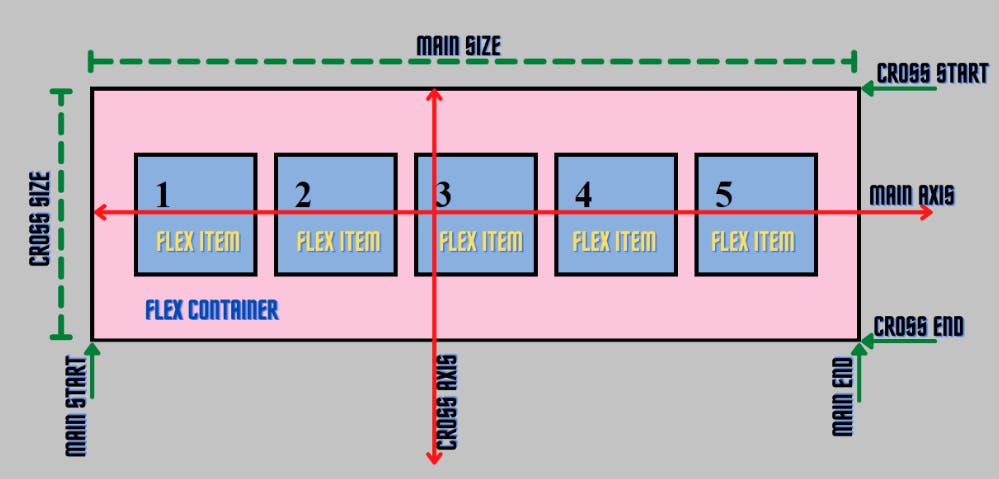
Flexbox Architecture:
The flex items can be laid out either along the main axis (starting from the main start and ending at the main end) or along the cross axis (starting from the cross start and ending at the cross end).
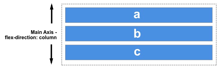
Main axis: Flex items are laid out along this axis, either horizontally or vertically based upon the flex-direction.
Cross axis: It is perpendicular to the main axis and its direction depends on the direction of the main axis.
Main size: It is the width/height of the flex item depending on the main dimension.
Cross size: It is the width/height of the flex item depending on the cross dimension.
The properties of Flexbox
The properties of Flexbox are:
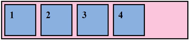
Displayrowrow-reversecolumncolumn-reverseflex-wrapflex-flowjustify-contentalign-contentalign-itemsflexalign-self1. display: Let’s make the container flex by setting its display to flex inside the .container of our CSS file.
  .container{
      display: flex;
      border: 5px solid rgb(0, 0, 0);
      background-color: rgb(245 197 221);
  }
Output: As you can see, after applying the display: flex property, the items have been aligned horizontally as the default flex-direction of flexbox is row.
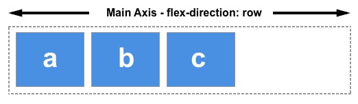
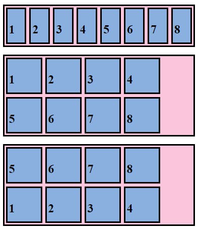
2.Row or Row-reverse, your main axis will run along the row in the inline direction.
3.column or column-reverse and your main axis will run from the top of the page to the bottom — in the block direction.
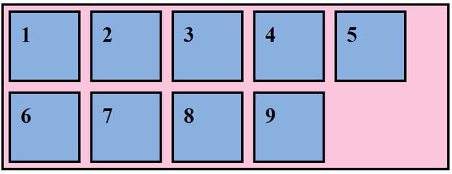
4. flex-wrap: It specifies whether the flex container will have a single line or multiple lines.
Syntax:
flex-wrap: attribute value;
Attribute values:
nowrap(default): It specifies that the flex items will not wrap and will be laid out in a single line. It may cause the flex container to overflow.wrap: It specifies that the flex items will wrap if necessary, and will be laid out in multiple lines.wrap-reverse: It is the same as a wrap, but the flex items will wrap in reverse order in this case.initial: It represents the value specified as the property’s initial value.inherit: It represents the computed value of the property on the element’s parent.
5. flex-flow: It is a shorthand for flex-direction and flex-wrap. By default, flex-direction is row, and flex-wrap is nowrap.
Syntax:
flex-flow: flex-direction flex-wrap
For example, we can specify flex-direction as a row and flex-wrap as a wrap.
.container{
flex-flow: row wrap;
}
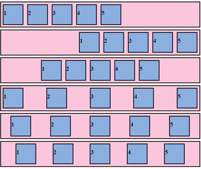
6. justify-content: It defines how items are positioned along the main/primary axis of the current line.
Syntax:
justify-content: attribute value
Attribute values:
flex-start(default): Flex items are positioned at the beginning of the container.flex-end: Flex items are positioned at the end of the container.center: Flex items are positioned in the center of the container.space-between: Flex items are distributed with even spacing, the first item will be at the start and the last item will be at the end of the container.space-around: Flex items are distributed with even spacing, with half the amount of space at the start of the first item and at the end of the last item.
7. align-content: When there is extra space in the cross-axis, align-content aligns multiple lines within the container. It is similar to justify-content which aligns individual items within the main axis.
Syntax:
align-content: attribute value
Attribute values:
flex-start: Lines are aligned toward the beginning of the container.flex-end: Lines are aligned toward the end of the container.center: Lines are aligned toward the center of the container.space-between: Lines are evenly distributed, the first item will be at the start and the last item will be at the end of the container.space-around: Lines are evenly distributed, with half the amount of space at the start of the first item and at the end of the last item.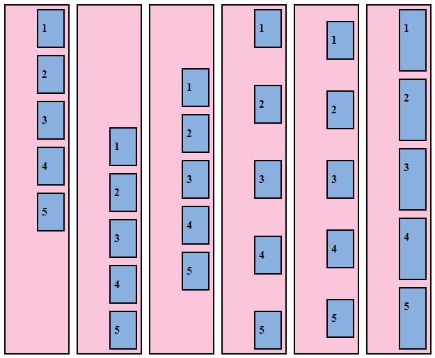
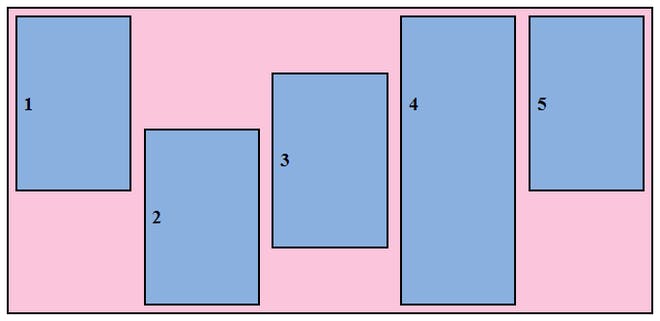
8. align-items: It defines how flex items will be aligned along the cross axis of the current line of the container.
Syntax:
align-items: stretch|center|flex-start|flex-end|baseline|initial|
inherit;
Attribute Values:
flex-start: Items are aligned along the cross-start line.flex-end: Items are aligned along the cross-end line.center: The items are centered in the cross-axis.baseline: The items are aligned in a line in such a matter that their baselines align.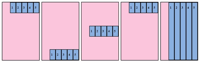
9. flex: It specifies the components of a flexible length and it is a shorthand property for:
Syntax:
flex: flex-grow flex-shrink flex-basis|auto|initial|inherit;flex-grow: It specifies how much the item will grow compared to other items inside that container.flex-shrink: It specifies how much the item will shrink compared to other items inside that container.flex-basis: It specifies the initial size of the flexible item.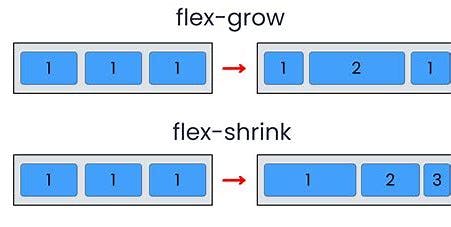
10. align-self: It defines how individual flex items are aligned along the cross-axis.
Syntax:
align-self: auto|stretch|center|flex-start|flex-end|baseline|
initial|inherit;
Attribute Value:
flex-start: Aligns items at the beginning of the container.flex-end: Aligns items at the end of the container.center: Aligns items at the center of the container.stretch: Aligns items to fit the container.baseline: Aligns items to the baseline of the container.auto(default): Item inherits the align-items property of parent container.initial: Sets to the default value.inherit: Item inherits align-self property from its parent element.
For more practice please Refer:-
. Flexbox Froggy - A game for learning CSS flexbox
HAPPY Learning!!!!💫